Everyone wants a website that loads quickly and flawlessly.
But you must also have a site that contains great images. With more and more users surfing on high-quality (including retina) displays, quality images are becoming more and more important.
As a designer you must balance creating and using great images with load times to maximize your site projects.
advertisement
Nothing takes away from a great image more than a site that does not load. So think carefully about images, from selection to optimization to number used.
No Pixels, Please


Understanding resolution is a great starting point in working with images. You typically do not want users to see pixels.
Resolution refers to the level of detail an image contains. Resolution is often measured in pixels or dots per inch (PPI or DPI). (The terms pixels and dots per inch have become intertwined and many designers use them interchangeably, although DPI is more frequently referred to.) Higher numbers mean more detail, lower DPIs have less detail. The typical web resolution is 72 DPI, for retina display it is 264. As a rule of thumb, most designers are working at double screen resolution for retina display.
But for standard web pages, 72 DPI is sufficient. Try to avoid images that are of any lesser quality.
Also think about pixel resolution. How large will an image display on the screen? It is important to size an image for the space it will occupy. For example, and image that will fill a space 800 pixels wide by 300 pixels high should be cropped and saved as such with a resolution of 72 DPI.
Once the image is saved at that size though, it can not be made larger without sacrificing image quality. It is best to save original copies of all images.
Vector vs. Raster

There are two basic types of images – vector and raster.
Vector images are made from many tiny lines and curves to create an image that does not lose quality when it changes size. These types of images are typically drawn in software such as Adobe Illustrator. Vector images are used to create logos, buttons, icons and many other graphic elements.
Raster images are most everything else. They are made up using thousand and millions of pixels to create an image. Raster images can be shrunk without hurting image quality but they can never be expanded beyond the original image size without a loss of quality. Raster images include photos, some drawings and even once-vector elements that have been saved in other file formats.
File Types and Uses


Most of the images you see on the web are one of three file formats – jpeg, gif or png. Each of these are raster formats. They are commonly used, easy to save and compress and work across platforms.
You may also come across a handful of other raster formats such as tiff or native files such as psd. These file types are often saved at sizes too large for optimum web use.
Vector images can be identified by file type as well. The most common formats are drw, pif, eps and svf; the most common native format is ai.
Optimize and Save Properly

It goes without saying that images of more quality and size will have larger file sizes. But you can do a few things to help ensure that your images will render better online.
It all starts with how each image is saved. Don’t just put files online without saving for the web first.
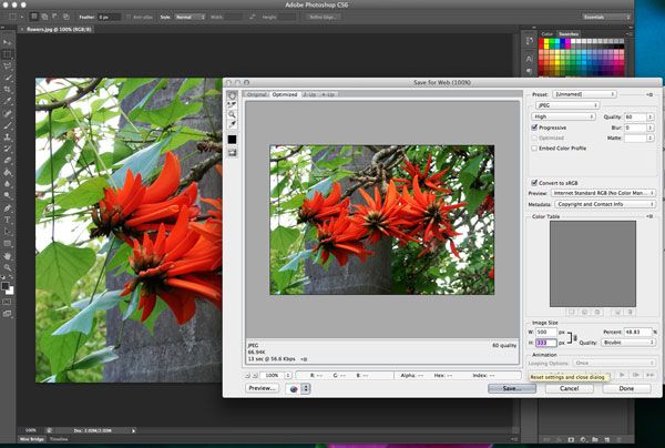
Saving for the web is really simple in standard photo editing software such as Adobe Photoshop.
- Open the image and from the File menu, select “Save for Web.”
- When the box opens up, select a file type. When saving as a jpeg consider the progressive scan option; it will gradually render the image as the site loads (this is especially helpful for larger images). Save animated images in the gif format to preserve animations (and make sure to check the “play” button). Save transparent images as png files.
- Select color options; opt for web-safe colors for an even smaller file size.
- Select a file size at the bottom right. Make sure the width and height are locked so that the image scales proportionately. Remember to save the image at the size it will appear online. There is no advantage to saving it larger, that will only create a larger file, which can take longer to load.
Quality Over Quantity


Having tons of images may not be the best solution for your site. Instead concentrate on a few high-quality images rather than many smaller, subpar images. The effect will be more dramatic and you won’t have to sacrifice image quality.
Consider creating graphic parts as CSS-generated parts rather than as images. (This can really help load time on the retina display.)
Save images to work with the size of your display. When thinking about more responsive design schemes, the image should be saved at the largest size it will render, not the smallest.
For images that are the full size of the screen, think about the most common monitor sizes – 1,366×768; 1,280×1,024; 1,280×800 and 1,024×768.
Then make sure to test every site in multiple environments to see how images react. Do they render well? How quickly does each load? Are pixels visible?
Conclusion
With so many options out there, quality is key for the most successful websites. A user is unlikely to return to a site with poor image quality and long load times.
Remember to use top-notch images, optimize for the web and consider the value of each image as you plan a site design.