There is not much to say when you see such extraordinary typography examples and all made by one man (one agency to be more specific). Serial Cut is a multinational Spanish company that specializes in photography, design, motion-graphics and 3D design. The images below show that they simply took typography at another level.
I know that there are only ten examples, but each one deserves at least double the time you were used to grant for a normal typography article. In order to make sure that you don’t miss any stunning details, we will make a short analysis at the beginning of each image. Unfortunately, the photos are only available at this size! I know, such a pity, but I think we should be glad that the images are clear enough for us to view. Nevertheless, I now invite you to enjoy, be inspired and if you will like this article then please share it with your friends or community! Many thanks! Cheers!
P.S. For other interesting articles on typography and fonts click 28 Gorgeous Typography Examples, 10 Cool Fonts That You Should Use or 15 Eye Candy Fonts That You Shouldn’t Miss.
Respect our work! Don’t copy our articles!
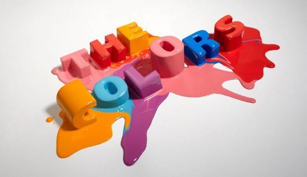
The Colors
advertisement
The paint that was “thrown” on these letter create the impression of joyfulness and liveliness. Great choice if you target young people.

Flexipop
Flexipop creates the illusion of a metallic skeleton. What makes it really cool is the stylish metallic “tail” (or winding thing) as well as the white painted front parts. These two adjustments transform it from a rather dull example to one that it’s actually a great source of inspiration.

LEVEL
The typography in this image it’s not that impressive, but in this context it fits extraordinary well. Therefore, it’s a great example of how to maximize the limits of the font.

Carousel
Well, no comment to make here. This is simply gorgeous.

Icon
If you pay enough attention, you will see that this font is made from toys (not from candies, as it seems). Furthermore, it’s quite impressive that most of them are different from each other.

A Denim History
Well, this is a fancy one…It tries to combine history with a modern approach. It also gives you a sense of elegancy.

OOPS
You have to admit that this one is really creative. No comment here either.

Carousel 2
From all the 3 Carousel examples, this one seems to me the least successful. Nevertheless, it’s a great example and I think it would perfectly fit on a club poster.

Anatomy
This one is really eye-catchy and cool. Nevertheless, it’s a bold action as an unfortunate choice of effects could have turned this one into a nightmare.

Carousel 3
This is a simple and a effective way of attracting attention with typography. While Carousel 2 impressed because of its colours, with Carousel 3 things stand a little bit different. Here, the level of detail and the simplicity of the image makes it simply beautiful.
